

I have seen too many B2B website projects begin with colours, layouts, animations, and homepage sections.
I have done it too.
Should the hero feel more premium? Should the logo wall move higher? Should the service cards be simpler? Should the page feel more “enterprise”?
These questions are not useless. But they are not the first questions.
The first question should be simpler:
What is this page supposed to help the buyer understand?
That is the question I keep coming back to while reviewing my own site and working on client websites. A B2B website is not mainly a design project. It is a buying-clarity project.
Design matters. Speed matters. Copy matters. But they all serve the same job: help the right buyer understand whether the next conversation is worth having.
If the website cannot do that, making it prettier will not fix much.
A website is part of the sales process
A serious B2B buyer rarely lands on your website ready to buy.
They usually arrive with a half-formed problem.
Someone mentioned your company. They saw a LinkedIn post. They searched for an answer. They are comparing options quietly before bringing the topic to a meeting. They know something is not working, but they may not know whether the real issue is strategy, execution, sales process, website clarity, reporting, or all of it together.
So they are not just browsing.
They are checking risk.
They want to know:
- Is this for a company like ours?
- Do these people understand our kind of problem?
- What exactly do they do?
- Can I trust them?
- What happens if I contact them?
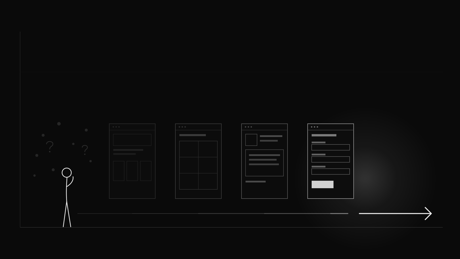
A good B2B website answers those questions in the right order.
Not all of them on the homepage. Not with one giant page that tries to explain the whole company. Page by page.
That is what I mean by conversion architecture: the structure behind buying clarity.
Not tricks. Not pop-ups. Not a louder call to action.
A clear path.
The homepage should orient, not explain everything
The homepage is not supposed to carry the whole sale.
Its job is orientation.
A visitor should quickly understand where they are, who the company helps, what kind of problem it solves, and where they should go next.
This sounds obvious until you audit real websites. Many homepages try to say every possible thing: every service, every sector, every belief, every case study, every internal distinction, every reason to care.
That usually creates the opposite of clarity.
When I audited bolkas.com, I noticed the same risk in my own language. The site had a clear point of view, but some of it was still too internally elegant. “Growth systems” made sense to me. A cold buyer still needed to understand faster whether I meant strategy, performance marketing, automation, fractional leadership, audits, implementation, or some mix of all of them.
That is the kind of problem design cannot solve on its own.
The homepage should work more like a routing layer. If the buyer is in the right place, it should help them choose the next page.
You do not need to explain the whole business at once. You need to make the next useful click obvious.
Service pages should help people recognise themselves
Most service pages are written from the seller’s side.
Here is what we offer. Here is what is included. Here is how experienced we are. Here is why this service is valuable.
Fine. But not enough.
A good service page helps the buyer recognise their situation.
The buyer should read it and think: yes, this is the problem we have.
That means a service page needs to make a few things clear:
- what problem the service is for
- what problem it is not for
- what the buyer gets at the end
- what decisions it helps them make
- what should happen before and after it
This matters because buyers often know the symptoms before they know the cause.
They know the website gets traffic but not enough useful enquiries. They know the sales team complains about lead quality. They know the reporting exists but does not change decisions. They know campaigns are running, but growth still feels unstable.
They may not know what the real constraint is.
That is why a service page should not just describe a service. It should help the buyer self-diagnose.
For example, the difference between strategy and execution has to be visible before someone contacts you. A company with unclear positioning does not need the same kind of help as a company with clear positioning but no execution rhythm. If your service pages blur those two situations, the buyer has to untangle your offer for you.
Most will not bother.
A systems page should help people choose
If a company has several services, it needs one page that helps people choose between them.
Not a vague “what we do” page.
An offer chooser.
Something as plain as this is often enough:
| If this is your situation | The relevant path |
|---|---|
| You are not sure what is broken | Diagnostic audit |
| You lack clear positioning or direction | Strategy work |
| You know the direction but not the execution plan | Roadmap work |
| The process depends too much on manual work | Automation or systems work |
| You finished a project and need ongoing calibration | Retainer or advisory support |
That table will not win a design award.
But it reduces confusion.
This is one of the most common leaks on B2B websites. The company has good services, but the buyer cannot easily tell which one fits. So they delay. Or they send a vague enquiry. Or they leave and look for someone who explains the problem better.
Clarity is not a small design detail. It is part of conversion.
Proof pages should be more honest than polished
This is the section I care about most.
Case studies are not decoration. They reduce risk.
A serious buyer is not only asking whether the work sounds good. They are asking whether it can work in a company like theirs, with their team, their sales cycle, their constraints, and their internal politics.
That means proof pages need more than a polished result and a quote.
They should explain:
- what the starting point was
- what problem had to be solved
- what work was actually done
- what you owned
- what the client owned
- what changed
- what cannot be claimed directly
I have had to think about this with Hydrogenera. A website or marketing system for a technical company is not just a prettier front end. It has to help different people understand different things: investors need confidence, buyers need product clarity, internal teams need easier publishing, and sales needs better context when someone enquires.
That is a much more useful story than “we redesigned the website”.
But even there, the proof has to be careful. If a company grows, launches products, improves investor communication, and strengthens its online presence, no consultant should quietly claim all of that as their result. The useful case study is more precise: here is what I owned, here is what the client owned, here is what changed, and here is what I would not claim.
That may feel less flashy.
It is more believable.
The about page should explain judgment
The about page is often treated like a polite biography.
A few career highlights. A founder story. Maybe a friendly photo. Maybe a paragraph about values.
For a B2B consultant, that is not enough.
The about page should explain judgment.
Why do you see the problem the way you do? What have you learned from the work? Why do you choose this way of working? What do you refuse to sell? What kind of client gets the most value from you?
This matters more for independent consultants than it does for large companies. There is no big agency brand absorbing the risk. The buyer is choosing a person.
So the about page should make the person easier to understand.
Not more polished. Clearer.
The contact page should not make the buyer do all the work
A lot of B2B contact pages are lazy.
They say “get in touch”, show a form, list an email address, and leave the buyer to decide what to say.
That creates weak enquiries.
A better contact page helps the buyer choose the right kind of next step.
If someone already knows what project they want to discuss, fine. Let them say that.
But many buyers are earlier than that. They know something is off, but they do not know what the work should be called. In that case, a structured diagnostic is often better than a blank contact form.
The form should ask questions that improve the conversation:
- What is the website?
- What problem do you see right now?
- What marketing activity is already running?
- What would a useful outcome look like?
- How did you find me?
Good form questions do not just qualify people.
They help them think.
Articles should be part of the path
Content should not float outside the website.
The website sells. The blog educates. The case studies prove. The contact page converts.
That separation is too neat.
Articles should be part of the conversion architecture. Each article should help a buyer understand one part of their problem and move toward the next useful step.
An article about dashboards should point toward measurement and diagnosis. An article about lead quality should point toward sales handoff and funnel flow. An article about automation should point toward mapping the process before choosing tools.
The point is not to paste the same call to action at the bottom of every article.
The point is to know what job the article is doing.
If an article creates recognition but gives the buyer nowhere useful to go, it is unfinished.
The order matters less than the job
There is no single perfect journey. Buyers enter from different places, but the architecture should still make sense. For consulting or advisory businesses, the standard logic is: orient (Home), choose (Systems/Services), self-diagnose (Service pages), reduce risk (Proof), explain judgment (About), build trust (Articles), and create a next step (Audit/Contact).
The navigation can vary. The logic should not. Every important page should do at least one of these things:
- increase recognition
- increase trust
- clarify the offer
- reduce risk
- make the next step easier
If a page does none of those things, it may exist only because someone thought the site needed it. That is not a good enough reason.
A simple test
Open each important page on your website and ask:
What question does this page answer for the buyer?
What uncertainty does it reduce?
What should the buyer do next?
What would be missing if this page did not exist?
If the answers are vague, the page is probably not part of a conversion architecture yet.
It may look good. It may sound professional. It may describe the company accurately.
But it is not doing enough commercial work.
A B2B website is supposed to help the right buyer move from uncertainty to diagnosis, from diagnosis to trust, and from trust to a clear next step.
Design should support that.
It should not replace it.
If your website looks fine but still does not create enough useful enquiries, the problem may not be the design.
It may be the architecture.
A good B2B website does not pressure people. It helps them understand whether the conversation is worth having.
If that sounds familiar, the Growth Audit is a good place to start.
Common questions
Questions this note answers
Is a B2B website a design project or a sales tool?
It is mainly a buying-clarity project, not a design project. Design, speed, and copy all matter, but they serve one job: helping the right buyer understand whether the next conversation is worth having. A serious B2B buyer rarely arrives ready to buy. They arrive with a half-formed problem and they are checking risk, asking whether this is for a company like theirs, whether these people understand their kind of problem, what exactly the company does, whether they can be trusted, and what happens if they make contact. A good website answers those questions in the right order, page by page. If the site cannot do that, making it prettier will not fix much.
What is conversion architecture on a B2B website?
Conversion architecture is the structure behind buying clarity: the deliberate order in which pages reduce a buyer’s uncertainty. It is not tricks, pop-ups, or a louder call to action. It is a clear path. The homepage orients rather than explaining everything. Service pages help the buyer recognise and self-diagnose their own situation. A systems or services page helps them choose between offers. Proof pages reduce risk by being honest about what was owned and what changed. The about page explains judgment. The contact page structures the next step. Each page does at least one commercial job rather than existing because someone thought the site needed it.
Why isn’t my B2B website generating enough enquiries even though it looks good?
If a website looks fine but does not create enough useful enquiries, the problem is usually the architecture, not the design. The pages may describe the company accurately and still fail to reduce buyer uncertainty. Common leaks include a homepage that tries to explain everything instead of orienting, service pages written from the seller’s side that do not help buyers self-diagnose, no single page that helps a buyer choose between services, polished proof pages that are not honest about what changed, and a lazy contact page that makes the buyer do all the work. Making any of these prettier will not fix a structural gap.
What should each page on a B2B website do?
Every important page should do at least one of five things: increase recognition, increase trust, clarify the offer, reduce risk, or make the next step easier. The homepage orients and routes. Service pages help buyers recognise their situation and self-diagnose, including what the service is not for. A systems page helps people choose the right offer. Proof pages reduce risk by separating what the consultant owned from what the client owned. The about page explains judgment, not just biography. The contact page helps the buyer choose the right next step instead of facing a blank form. If a page does none of these things, it is not doing enough commercial work yet.
Noticed a typo, technical nuance, or want to suggest an improvement?
Send feedback